The US Energy Information Administration (EIA) conducts a survey once every few years on residential energy consumption. The survey along with supplementary data contains the information on how much energy each residential unit consumed along with detailed characteristics of the residential unit and its household members.
I am interested in exploring this data to gain some insights on energy consumption. Before exploring the data, there are some preliminary questions we can ask that would guide our analysis. Is there a trend in energy consumption based on the year the house was built? Are modern houses generally more energy efficient than older houses?
Reading the Data
The latest Residential Energy Consumption Survey (RECS) conducted was for 2015. However, the final data product for the 2015 survey is not out yet. We are instead going to use the 2009 data. The survey data were obtained from a random sample of a primary housing unit selected to represent the US housing population. (Read the sample selection methodology in their technical document). The survey includes very detailed housing characteristics, household member characteristics, along with data on the use of appliances. It is supplemented with energy consumption data collected from the energy suppliers.
Importing.
import numpy as np
import pandas as pd
import matplotlib.pyplot as plt
import seaborn as sns
import math
sns.set_style("whitegrid")
Read in the data.
# read the data into a dataframe
data = pd.read_csv('recs2009_public.csv')

# layout file describing all columns
layout = pd.read_csv('public_layout.csv')
data.shape

>>>
(12083, 931)
There are 12083 samples and 931 columns. Let’s look at a sample of the data.
data.iloc[:3,:5]
>>>
| DOEID | REGIONC | DIVISION | REPORTABLE_DOMAIN | TYPEHUQ | |
|---|---|---|---|---|---|
| 0 | 1 | 2 | 4 | 12 | 2 |
| 1 | 2 | 4 | 10 | 26 | 2 |
| 2 | 3 | 1 | 1 | 1 | 5 |
layout.iloc[:3]
>>>
| Variable Name | Variable Label | Variable Order in File | Variable Type | Length |
|---|---|---|---|---|
| 0 | DOEID | Unique identifier for each respondent | 1 | Character |
| 1 | REGIONC | Census Region | 2 | Numeric |
| 2 | DIVISION | Census Division | 3 | Numeric |
Note that most of the categorical features are encoded into int. The corresponding descriptions to the label can be found in a supplementary document from the EIA website.
Exploring the Data
The quantity we are interested in is the electricity usage. This is in column "KWH", which is the total electricity usage in the year 2009 in kilowatt-hour. We first take a look at the distribution to get an idea of what the values are.
print 'Mean, Std:', data['KWH'].mean(), data['KWH'].std()
>>>
Mean, Std: 11288.1593975 7641.19084518
# plot the KWH distribution
fig, ax = plt.subplots(figsize=[8,6])
ax.set_xlim(0,80000)
sns.distplot(data['KWH'],ax=ax, bins=100)
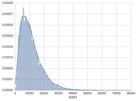
The distribution looks skewed. It has a long tail. We can log transform the KWH data and add it to the dataframe.
data['log_KWH'] = data['KWH'].map(np.log1p)
Look for outliers in "KWH".
# Looking for data with log_KWH larger than 3 standard deviation from the mean.
print 'Data > 3*Sigma:'
print data.loc[data['log_KWH'] > (data['log_KWH'].mean()+3.*data['log_KWH'].std()), 'KWH']

# Data with KWH larger than 60000
print 'Data > 60,000 KWH:'
print data.loc[data['KWH']>70000, 'KWH']

>>>
Data > 3*Sigma:
3551    150254
8112     77622
Name: KWH, dtype: int64
Data > 60,000 KWH:
3551    150254
4839     72865
8112     77622
9129     72725
Name: KWH, dtype: int64
There is only one entry with an unusually large KWH. Entry 3551. We will remove this entry. We can also perform an outlier detection using a set of features if needed.
# Removing this entry
data = data.drop(3551)
Looking at distributions of other main features.
fig, axarr = plt.subplots(2,2,figsize=[10,8])
col = ['YEARMADE','NHSLDMEM','TOTSQFT_EN','HHAGE']
title = ['Year Made','Number of Household Members','Total Square Footage','Age of Household Member']
for i in range(4):
    axarr.flatten()[i].set_title(title[i])
    sns.distplot(data[col[i]],ax=axarr.flatten()[i],kde=False)
    axarr.flatten()[i].set_xlabel('')
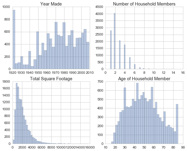
Some of these bins suggest some censored data. For example, the year made started from 1920. Houses built prior to that year might be put as 1920. We can look at the imputation flag to see how many of these data points were imputed. Similarly for the age data.
data.loc[data['YEARMADE']==1920,'ZYEARMADE'].value_counts()
>>>
0    708
1    189
Name: ZYEARMADE, dtype: int64
Only about 15% were imputed. The number for 1920 is quite high. We don’t see any house that was built prior to 1920 even though the year range is reported to be 1600-2009. From the survey form, the participants were asked to fill in the estimate year the house was built.
Let’s explore some other important features. (I will omit all the plot codes for the rest of this post to save some space. They are all on the GitHub page).
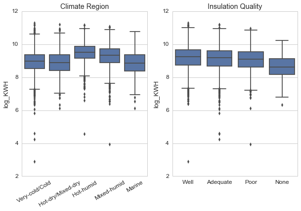
The 'Climate_region_pub' column divides housing unit into broad regions according to the climate. The hot and humid region shows the largest mean for energy usage. I expected the insulation quality to show larger usage for poorly insulated units, but we don’t see it here.
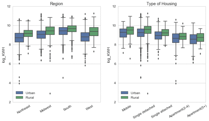
There are notable differences between regions. All the mean values for the urban area are smaller than the rural area in the same region. We might expect that urban units would generally have smaller square footage than rural units.
The column 'TYPEHUQ' gives the categories of the housing unit. The types are mobile home, single-family detached, single-family attached, apartment unit in building with 2-4 units, and apartment unit in building with 5+ units. It is not surprising that apartments on average use less energy than single-home.
We can take a look at the square footage data next.
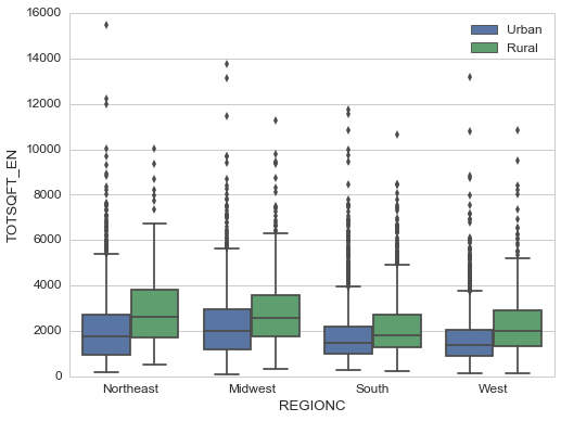
As expected, rural houses have larger square footage in general. Northeast and Midwest regions also seem to have larger square footage than the south and west regions.
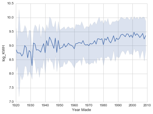
The line shows the mean of 'log_KWH' for each year, and the filled region is +/- one standard deviation. Surprisingly, the trend shows an increase in energy usage with year-built. Recently built houses use more energy on average than older houses. It would be interesting to see if this trend continues after 2009 after the new data is released. Why do newer houses use more energy? We can take a look at the square footage data.
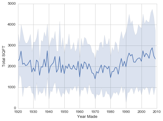
There is indeed a trend of increasing square footage for newer houses. Does this suggest that people are more likely to build larger houses than in the past? There is a lot more you can do with year-built data. But for this project, we will keep the focus on energy usage.
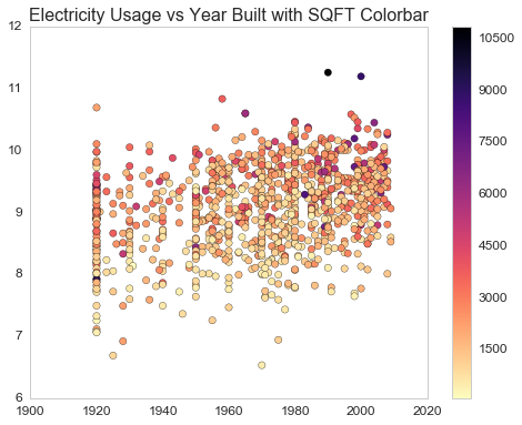
Lastly, we can combine the year-built and square footage columns to see the energy usage with a scatter plot. Since we have a large sample, it will be easier for visualization to plot a subsample of the total 10,000+ samples.
from sklearn.utils import resample

# Select a subsample
subdata = resample(data, replace=False, n_samples= 1000, random_state=42)